
Classification
Dashboard
For classification tasks, percent accuracy and AUC are shown. These are computed using all Gold Standard cases where the Centaur labelers have reached consensus.
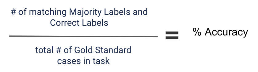
Percent Accuracy
The percent accuracy is the percentage of Gold Standard cases where the resulting Majority Label matches the Correct Label.
Average AUC (Area Under the Curve)
The AUC summarizes the tradeoff between precision and recall for a single answer choice by calculating the area under the precision-recall curve (explained below). AUC is a number between 0 and 1. The closer the AUC is to 1, the better. The average AUC shown on the portal is the average of the AUC for each answer choice in the task.
Average Agreement
The case-level agreement is defined as the fraction of qualified opinions from Centaur labelers that match the Majority Label. The task-level average agreement is calculated as the average of case-level agreement over all Labeled and Gold Standard cases.
Charts and Tables
Confusion matrix
The confusion matrix shows our labelers’ answers (Majority Label) versus the correct answers (Correct Label) on Gold Standard cases where our labelers have reached a consensus. The cases on the diagonal are the number of cases in each class where both the Majority Label and the Correct Label are the same, whereas the cases outside of the diagonal indicate cases where the Majority Label differs from the Correct Label on Gold Standard cases.
Classification tasks
Take a look at this classification task example:
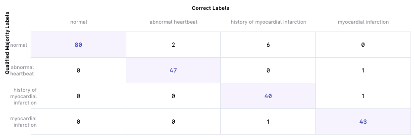
Let’s look at the first row. Summing up all of the values, 88 Gold Standard cases have a Majority Label of “normal”. However, only 80 of them also have the Correct Label of “normal”. 2 of the Gold Standard cases with the Correct Label “abnormal heartbeat” were incorrectly identified by Centaur labelers as “normal”, as demonstrated by the second cell in the first row. Taking a look at the second column, of the 49 Gold Standard cases with the Correct Label “abnormal heartbeat”, Centaur labelers correctly identified 47 of them. They labeled 2 of the Gold Standard cases with the Correct Label “abnormal heartbeat” as “normal”, as you can see in the first cell of the second column.
Looking at the confusion matrix for classification tasks can help you determine Centaur labelers’ overall performance on the task, as well as their performance on specific classes.
Note: Confusion matrices are not generated for variable answer choice tasks (tasks where the answer choices vary for each case).
Read about matrices for multi-select classification here.
Label distribution
The label distribution bar graph shows the breakdown of Gold Standard cases by class versus Labeled cases. The label distribution graph can be used to assess whether the class breakdown is consistent with your expectations if known.
Labeling rate
The labeling rate chart shows how many total cases were labeled by a given day. This chart will only include dates where contests were running, as that’s when cases move to Labeled.
Precision-Recall Curve
A Precision-Recall Curve shows the tradeoff between precision and recall for different thresholds.
Consider an example task with two answer choices. We can produce a score for each choice based on the volume of qualified reads for that answer choice on a given case, e.g. 75% choice A, 25% choice B. Then, we can pick a hypothetical score threshold for labeling a case as choice A.
For example, we can say any case where choice A gets a score above 60% (e.g., gets >60% of the votes from qualified reads on the case) gets labeled as choice A and otherwise gets labeled as not choice A (i.e. choice B).
With a 60% score threshold, some of the Majority Labels would match the Correct Label on Gold Standards, and some would not; this gives us a precision (the percent of cases labeled as choice A that match the Correct Label) and a recall (the percent of cases where the Correct Label is choice A that actually got labeled as choice A), and together these are the coordinates of a single point on the precision-recall curve (since the axes are precision and recall).
Here, the Precision-Recall Curve will show that a higher score threshold for choice A will reduce the number of labels for choice A, so it will tend to decrease false positives (higher precision) but also decrease true positives (lower recall). Conversely, a lower score threshold increases the number of labels for choice A, which generally decreases precision (due to more false positives) but increases recall (due to more true positives).
By calculating a precision and recall value for a range of thresholds, we obtain a single precision-recall curve. A high AUC represents a more favorable tradeoff between precision and recall since each threshold will tend to correspond to both a high precision and a high recall. The more favorable this tradeoff, the better the classifier. We generate and display a precision-recall curve for each possible classification in a task, by going through the above process once for choice A, once for choice B, etc. In our case, the score we compare to each hypothetical score threshold is the percentage of qualified reads that voted for that answer choice.
Per-class metrics
This table contains the precision, recall, and specificity values for each label class. Precision for class A is the percent of cases labeled as choice A that match the Correct Label. Recall for class A is the percent of cases where the Correct Label is choice A that actually got labeled as choice A. Specificity for class A is the percent of time we correctly identified cases that were not class A (= Gold Standard cases whose Correct Label is B AND the Majority Label is B / Gold Standard cases where the Correct Label is B).